
Component: Logo Rail
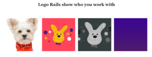
The Logo Rail allows you to display thumbnail images and logos. This component can be useful when showing who your company has worked with or what your product interfaces with.
Settings
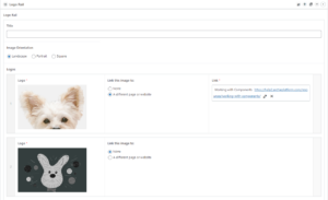
Logo Rail
The top section of the component contains the settings and information that applies to the overall component.
Section Title
The text that will be displayed at that top of the component. This field is optional. This component does not currently have a subtitle.
Image Orientation
Logo rails offer three different image orientation options to choose from. Those options are landscape, portrait, and square.
Images
To add your image, simply click the “Add Image” button in the logo field, it will automatically be resized to the image orientation chosen above. Images can also be used as links. To make an image a link, select “A different page or website” under “Link this image to” and fill out the prompt with where it should link to. Images can be rearranged by dragging them up or down in the list.
Column Count
Column count sets how many logos are displayed on screen at once. keep in mind that users are able to scroll through all the logos regardless of how many are set to display at once.