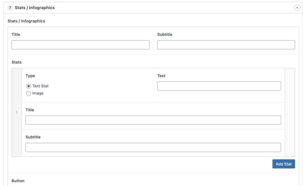
Component: Stats/Infographics
The Stats/Infographics component provides a prominent display of information in a 2, 3 or 4 column layout. You have the option of displaying the information as large text or graphic.


Working with Stats/Infographics
The order of the stats can be changed before or after you enter the content by clicking and dragging the the light grey bar that contains the card order number, then releasing it in a new location. The number of columns will be determined by the number of stats you add.
Settings
Title
The text that will be displayed at that top of the component. This field is optional.
Subtitle
The text that will be displayed at that top of the component, beneath the title. This field is optional.
Stats
This section contains the information for each individual stat.
Type
Text Stat will display text that is entered into the Text field to the right
Image will present an “Add Image” button to select a graphic to be used in place of the text stat. Recommended width is 400px.
Pro Tip: If you decide to use images in your stat component, make all 3 images the same size to assure the graphics appear aligned on screen.
Title
This will display a title under the stat. This field is optional.
Short Description
This will display a description for the individual stat under the title. This field is optional.
