
Component: WYSIWYG Editor
The WYSWIYG Editor is a highly flexible component allowing you to add text, images and flexible content to the page.
Options & Settings
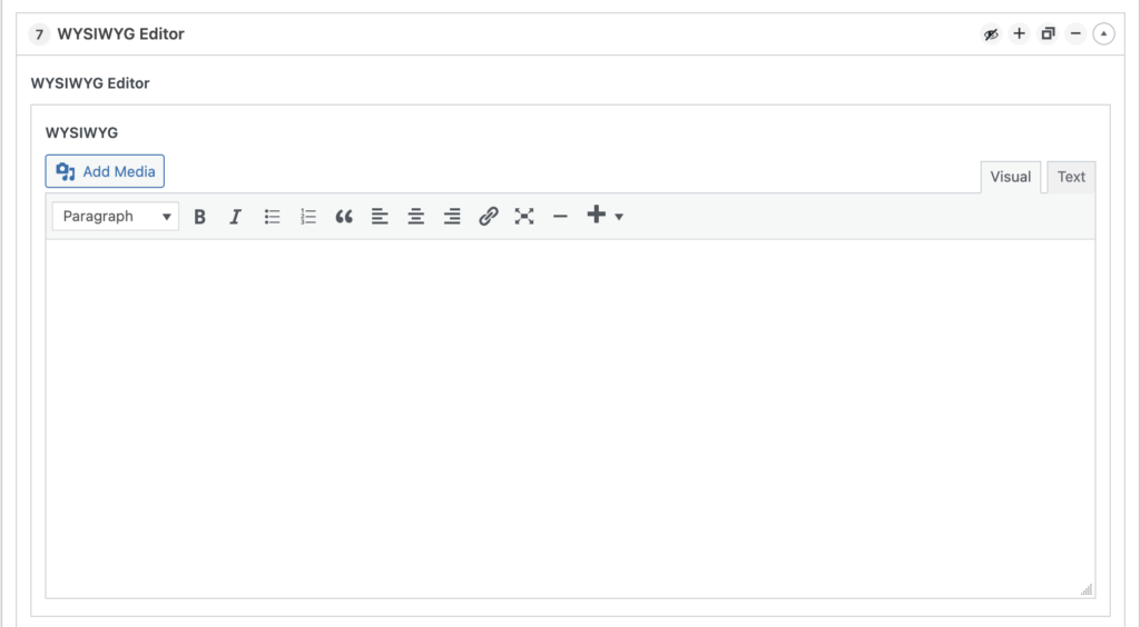
The WYSIWYG Editor has various options at the top of the component.
Add Media Button
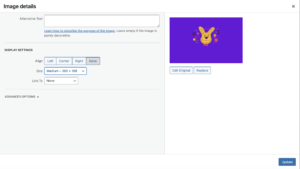
Use this button to insert images in various file formats as well as videos. You can click on an image and edit it to adjust the image alignment and display size within the WYSIWYG.
Editor Toolbar
This area provides several options for formatting. If you’ve worked with other website builders and editors in the past, this all likely looks familiar:
- Text Style dropdown is used to select the desired pre-formatted text style (Paragraph, H1, H2, etc) to be applied to your text. These styles are preset when your site is designed. The styles applied to each text format can not be changed.
- Text attributes allows you to apply Bold or Italic styling to highlighted text.
- Bullet and numbered lists
- Blockquote allows you to highlight a block of text within your layout.
- Text alignment Left justified, centered and right justified text.
- Link option to add a hyperlink to a highlighted block of text.
- Option to add a horizontal line to separate sections of text.
- Option to add a button with the site’s default button styles.
View Tabs
The Visual and Text tabs provide two different ways to view your content:
- Visual provides a rough approximation of what your content will look like when published. Note, your font and site specific details might not show in this view.
- Text provides a “code” view to allow you to see the markup behind the content. You can manipulate the mark up and/or add embed codes here.
When working with the the WYSIWYG Editor, you can compose within the editor or copy/paste from an external document (Like Word, Google Docs).
Pro Tip: When copy/pasting from another doc, use your browsers “Paste and Match Style” command (Shift+cmd+v on Mac, Shift+ctrl+v on PC) to strip out hidden formatting that may cause issues with your sites styling.